City Harvest
Pitch
Creative Challenge: Bring Feed Good to life in a way that makes hunger feel like a shared New York responsibility—not just a nonprofit message—so that everyday New Yorkers feel personally connected, culturally proud, and motivated to donate. The work must turn awareness into action by showing how feeding others is simply what New Yorkers do, reinforcing brand recognition while driving urgency around the local hunger crisis.
Our ways in were simple: First, New Yorkers are tough by nature—but when the city’s in need, we look out for one another. It’s just what we do. Second, in a place that moves this fast, the need for help hits just as quickly. By reminding people that caring for our neighbors is part of the city’s DNA—and that food insecurity is happening right now, all around us—we can make the issue feel personal, urgent, and impossible to ignore.
Agency: One Horizon
Executive Vice President: Roberto Alcazar                                                                                                                                 Executive Creative Director: Todd Feitlin
Creative Director: Giselle Rafful
Art Director: Cara Cohn


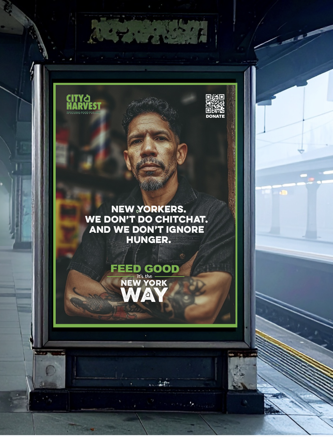
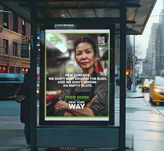
Concept 1: The New york way
THE CAMPAIGN
Celebrates the contradiction that makes New York, New York.
Real New Yorkers don't help people because it's nice, we help people because it's what we do.
VISUAL STYLE
A raw, authentic look of New York pride. We highlight the everyday people who form the city’s backbone and embody
the spirit of looking out for one another.
TONE OF VOICE
The no-nonsense attitude of the New York we all know and love.

Visual breakdown
Key lockup
City Harvest’s brand uses a rounded sans serif to feel approachable and accessible, so I built from that foundation with a bold sans headline for clarity and impact. “New York Way” is treated with texture to reflect the grit and urgency of the city, while a small script accent in “It’s the” introduces warmth and a human voice to balance the strength of the main type.
The brand green is carried through the logo and the horizontal lines to help visually balance the composition and clearly separate the two messages — “Feed Good” and “It’s the New York Way.” This keeps the call to action distinct while still feeling unified under City Harvest’s visual system.
Images
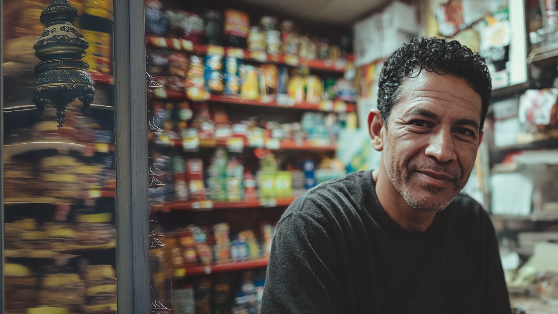
As someone who has lived in New York for the past three years, I wanted to highlight the true backbone of the city — the familiar faces we see every day: bodega workers, cab drivers, doormen, and small business owners. It was important to show that anyone can donate, especially the average New Yorker.
These individuals needed to feel confident, with just a slight chip on their shoulder — tough at first glance, but warm if you look a little longer. In every image, they carry that quiet pride New Yorkers are known for. I also incorporated a cool blue-green filter to emphasize the city’s grit and edge. No matter their background, New Yorkers show up for one another — that’s just what we do.
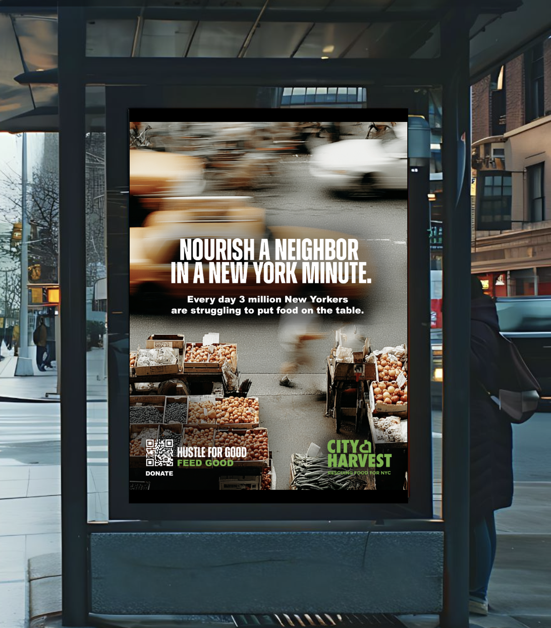
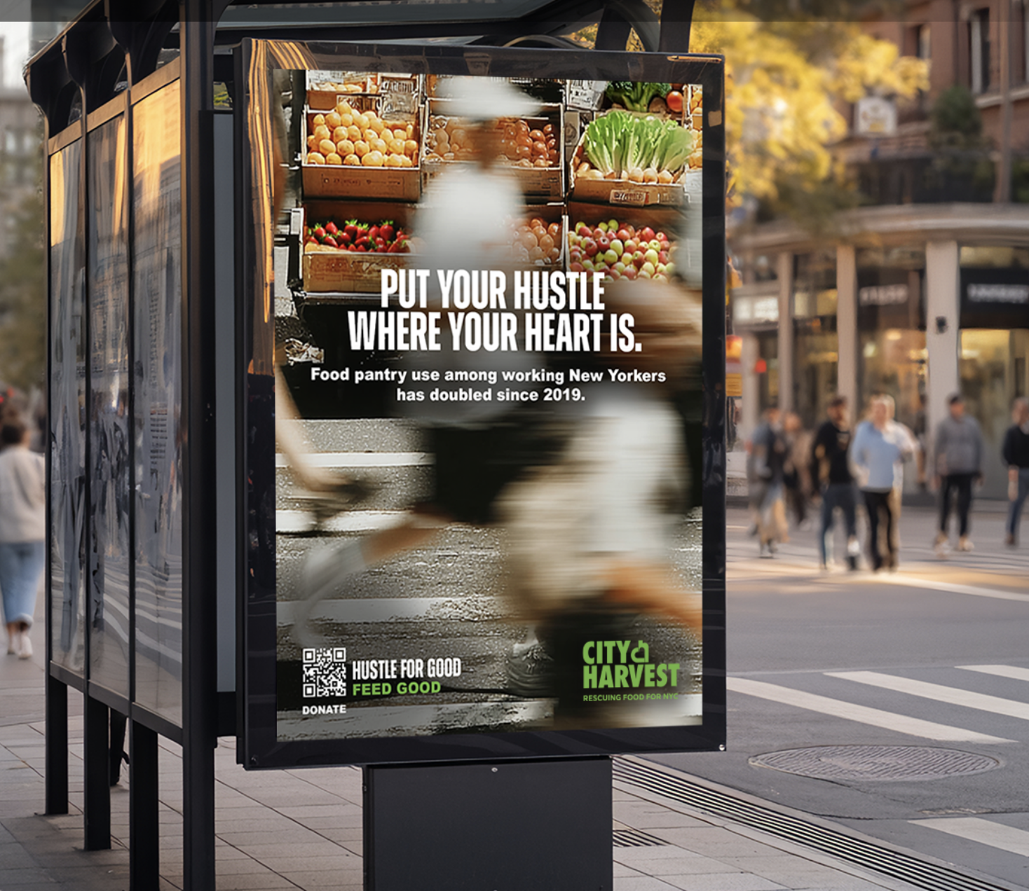
Concept 2: Hustle for good
THE CAMPAIGN
Channel the city's urgent and fast pace lifestyle, reminding us that just like New Yorkers, the fight against hunger has no time to waste.
VISUAL STYLE
Create an energetic feel that mirrors the city itself. The photography will always focus on fresh food – a point of clarity and purpose amidst the surrounding chaos.
TONE OF VOICE
Our message is one of urgent hope: by channeling our collective New York hustle towards fighting hunger, we can make a profound difference.

Visual breakdown
Key lockup
The lockup was designed to feel bold, direct, and unmistakably New York. I chose two condensed, sans-serif fonts that feel like they belong in the same family so the headline reads as one unified statement, but with subtle contrast. The top line, “Hustle for Good,” uses a slightly narrower, longer font to stretch across the space and mirror the constant forward motion of the city. The bottom line, “Feed Good,” uses a heavier, more compact weight to land the message with impact and create a clear visual hierarchy.
Because the background imagery in the campaign is intentionally busy and rooted in real New York environments, the typography needed to be simple, bold, and highly legible at a glance. Clean letterforms, tight tracking, and strong weight ensure the message cuts through quickly — whether on the street, in transit, or on social.
The white and green color contrast reinforces clarity while also tying back to City Harvest’s brand equity. The green grounds the message in food and impact, while the stark white type keeps the tone confident and no-nonsense.
Images
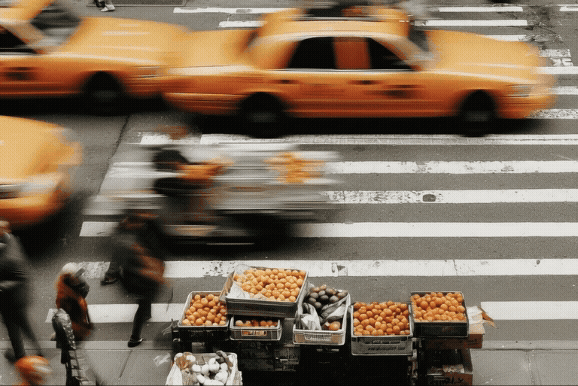
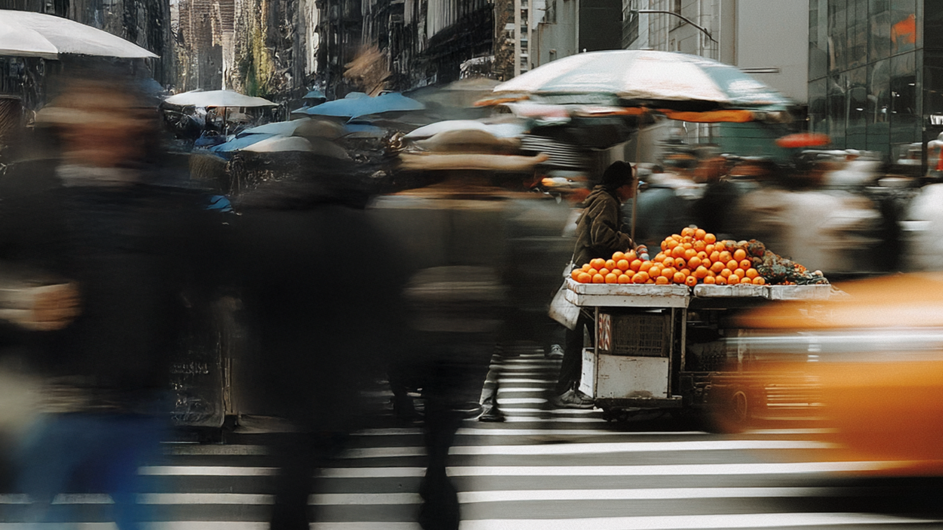
Inspired by long-exposure photography, the visual approach captures the constant motion and hustle of New York City. The blurred figures and traffic convey how fast the city moves, while the food remains in sharp focus — a reminder that, in the middle of all that movement, hunger is still present and can’t be ignored.
To further pull the viewer’s eye, we used vibrant, colorful fruit — especially bright oranges — as a visual anchor. The pop of color cuts through the otherwise grainy, muted palette of the city and immediately signals food, nourishment, and urgency. Against the cooler, desaturated tones of the environment, the fruit feels alive and impossible to overlook.
By isolating both the food and its color as the clearest elements in the frame, the imagery underscores immediacy. In a city that never slows down, hunger is the one thing that doesn’t have time to wait. This contrast between motion and stillness, and between muted tones and bold color, helps highlight the urgency of the hunger crisis and makes it feel present and happening right now for New Yorkers.